Master Bedroom || Layout
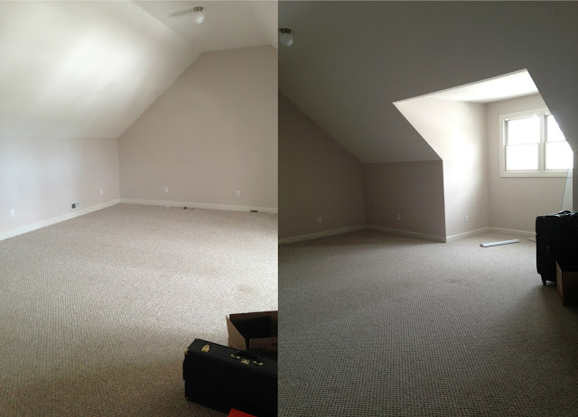
Paul and I had some house projects we wanted finished before Theo was born. Some of them we completed, some are still sitting unfinished (ahem... nursery... cough cough). Unfortunately most of what we needed to get done wasn't something that pregnant me could take on. One room that made the done list when it comes to renovations was converting our bonus (full of crap, cat room) into our master bedroom. I'll be sharing this room over the course of a few posts. It took quite some time to get to where it is now, so it deserves a few posts. Today I wanted to share the before photos and room layout we settled on. Here are photos from when we moved in.

And a photo literally when it was full of crap. Sorry. This room became a dumping ground, for cat poop and our junk. I mean this really does need a serious warning... it is bad. I know this, we literally never unpacked some boxes from when we moved in, and we threw empty boxes in here as well.

I told you. This was our "please guests don't look in there" room. We all have that space in our house right? Even if it is just a drawer. If you don't, please share your secrets.
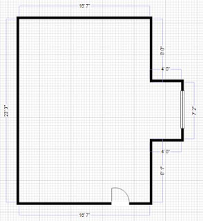
So space wise here is what we started with. A very typical over the garage bonus room. It is large at over 16 feet by 23 feet with a nice sized dormer alcove. What we needed to make this a functional new bedroom was a closet, to paint the walls, ceiling and trim, new carpet (kitty litter dust and carpet is the worst), and some electrical work along the way.

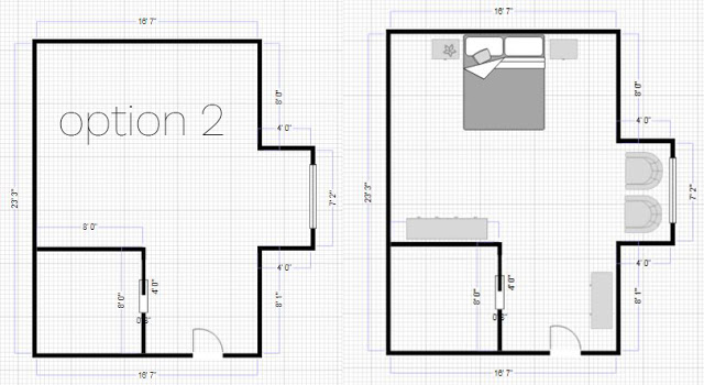
When we first bought the house I toyed with the idea of adding a bathroom as well... but in addition to being a huge cost we would have over improved our house for our area. My first thought was to just build a wall in the back of the room, no doors even just a walk around wall and build in shelving. Problem is the pitch of the roof would have made doors a challenge, below is what my initial thoughts were.

Option 2 felt more involved, and it was. But it had Paul framing and building an 8'x8' closet in the immediate left corner of our room. What I like about option 2 is the fact that when you enter the room it feels like there is a hallway almost with the closet on the left. It made our bed tucked away a bit more and I was hoping it would be cozier.

So given both options, we went with the 2nd choice. It was going to be more work, but maybe made more sense with the way the walls slope down.

So there is our layout! Our next master bedroom post will be an overview of all of the work that went into the room. I would not call our room 'finished' yet. Decorating wise we still have plenty to do.

